Econometrics
Marginal Emissions in the CA Power Grid
A new solar panel doesn't offset the average power plant, but whichever one was about to come online. That can be worth a lot of carbon.
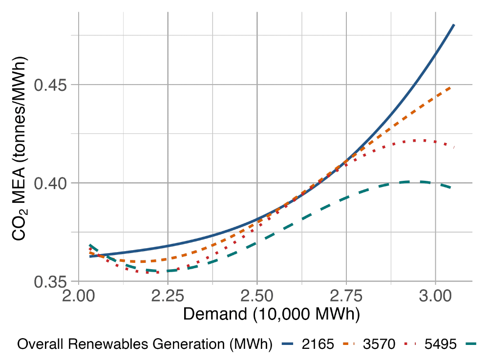
A megawatt-hour of solar power doesn’t offset the average power plant on the grid. It offsets whichever plant was about to ramp up next, and that plant changes hour by hour depending on how much California already needs. State and federal programs pay a flat rate for renewable generation, in cents per kilowatt-hour, no matter when that generation happens. This project asks whether that flat rate is actually rewarding the right hours, and finds that it probably isn’t.
The plant that actually gets displaced
Power plants come in three rough flavors. Baseload plants are cheap to run, so they stay on near full capacity all the time. Peakers are expensive to run but cheap to build, so they sit idle until demand spikes and then switch on. Wind and solar cost nothing to run once built, so their power gets used the moment it’s available. Whatever nonrenewable plant was next in line to meet demand, the “marginal” plant, gets pushed aside instead. Sometimes that’s a clean hydro unit. Sometimes it’s a dirty gas peaker. Which one it is depends entirely on how much the grid needs at that moment, which means the emissions a MWh of renewables actually avoids isn’t one fixed number. It moves with demand, and that movement is the whole story of this paper.
To measure it, I pulled six years of hourly data from CAISO, the operator that runs about 80% of California’s grid: hourly demand, generation broken out by fuel source, and hourly CO2 emissions, also broken out by source, since California requires utilities to report emissions this granularly. That’s close to 40,000 hourly observations, five million underlying data points once every fuel source is accounted for.
Getting a baseline number
Before asking how the offset moves, it helps to know what it is on average. That’s a fixed-effects regression:
Et = β · Wt + φ · Zt + ε
E is hourly CO2 emissions, W is hourly wind or solar generation, and Z is a set of controls: the level, square, and cube of demand that hour, plus a separate fixed effect for every combination of hour, day of week, and month across the sample (9,576 of them). Those fixed effects matter because they strip out routine daily and seasonal rhythms, like everyone turning on air conditioning around the same time solar output peaks, so that β isn’t accidentally picking up a coincidence. What’s left is closer to a causal number: how much a MWh of generation actually reduces emissions, holding the rest of the day’s pattern constant.
The answer is about 0.33 metric tons of CO2 per MWh for wind, 0.33 for solar, and 0.38 for all renewables combined. These line up reasonably well with prior estimates from other grids, which is a good sign the method is sound. But an average like this describes the grid in general. It says nothing about any particular hour, and that’s the more interesting question.
Why the average hides the interesting part
An average tells you about the grid you have, not the grid you’re changing right now. A MWh of wind at 3am, when the grid is quiet, might displace something very different from a MWh at 6pm, when the grid is straining. To see that difference, the model needs to let the size of the offset change with demand instead of assuming it’s constant. Formally, that means letting generation and demand interact nonlinearly, then asking how emissions respond to one more unit of generation, holding demand fixed:
MEA(W, D) = −∂E(W, D)∂W
That’s just a slope. Hold demand D at some level, and ask how much emissions drop as generation W ticks up by one more MWh. That slope is the marginal emissions avoided, MEA, and because the underlying model lets generation and demand interact, the slope is free to change shape depending on where you are on the demand curve, rather than being locked to the single number the first regression produced.
What the shape actually looks like
Wind and solar move in opposite directions, and the reason why is intuitive once you see it. At low demand, an extra MWh of wind offsets a bit less as demand climbs; wind’s benefit briefly dips. But past a certain point that reverses, and at the highest demand levels observed, wind’s offset climbs sharply, roughly tripling from its low point. Solar does the reverse: its offset rises steadily and smoothly as demand increases, because solar mostly displaces the gas peakers that only get switched on once demand is already high. A sunny hour is worth the most to the grid precisely when the grid is under the most strain.
Averaged across all renewables (Figure 1, above), the picture is a shallow dip that turns upward: offsets sit around 0.35 mT at low demand, ease down slightly, then climb toward roughly 0.45 mT as demand approaches its peak, a swing of about 30% from the flattest part of the curve to the busiest hours of the day.
Why a flat subsidy gets this wrong
Every major renewable incentive I could find (the federal Investment Tax Credit, California’s net metering and solar programs) pays a fixed rate per unit of generation, treating a MWh of solar at noon on a mild day the same as a MWh of wind during a July evening peak. If the true offset swings by 30% or more depending on timing, a flat subsidy is over-paying for the hours that do the least good and under-paying for the hours that do the most. A time-varying incentive, one that pays more for generation that shows up when the grid is already strained, would buy more emissions reduction per subsidy dollar without adding a single new turbine or panel. That’s a policy lever that costs nothing to build, only to design correctly.
None of this is the last word. The model assumes a cubic functional form for how emissions bend with demand, and it doesn’t yet control for weather directly, only for the seasonal patterns weather tends to follow; better wind-speed and irradiance data would sharpen the estimates. But the qualitative finding, that the marginal value of clean energy depends heavily on when it arrives, is unlikely to disappear with more data. It will just get more precise.
References & notes
- Novan, K. (2015). Valuing the Wind: Renewable Energy Policies and Air Pollution Avoided. American Economic Journal: Economic Policy, 7(3), 291–326.
- Cullen, J. (2013). Measuring the Environmental Benefits of Wind-Generated Electricity. American Economic Journal: Economic Policy, 5(4), 107–33.
- Zivin, S., Kotchen, M., Mansur, E. (2014). Spatial and Temporal Heterogeneity of Marginal Emissions. NBER.
- Scraper and simulation code available on request.